


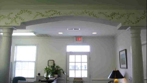
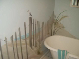
Murals and Decorative Arts
Each mural or decorative painting
is created just for the person and the place.
It reflects the owner more than the artist.
Whether it is painted on the wall,
the ceiling, the window or door...
inside or out... large or small...
it incorporates the tastes of the owners
who live with it day to day.
Walls, floor cloths, cabinets,
RV's, golf carts, windows -
most things can be painted.
The mood, the palette, and the subject
are selected in accordance with the owner.
Is custom artwork for your space
in your future?
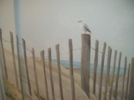
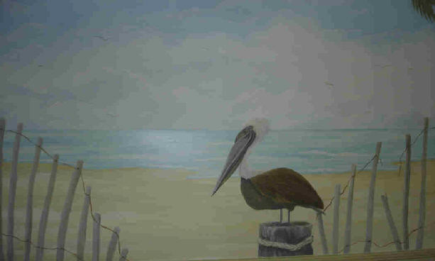
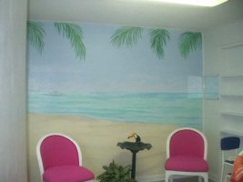
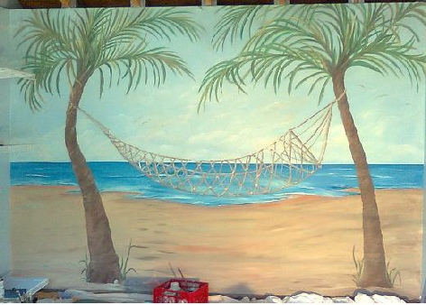
Beach mural
Please visit again, soon!
This web site, all artwork and information is copyrighted and subject to Federal Copyright Laws.
All rights are retained by Jackie Stacharowski unless otherwise negotiated.
The viewer of this information understands and agrees that these concepts are
the property of Jackie Stacharowski and may not be copied without the written agreement of the artist.


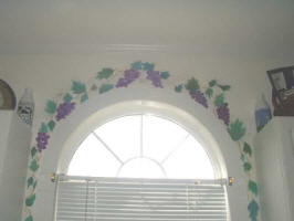
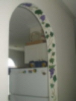
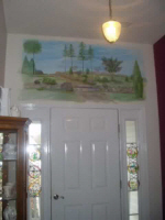
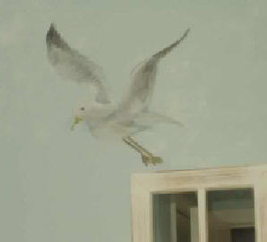
Vine around window
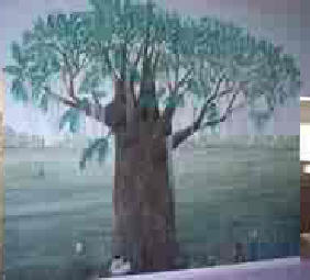
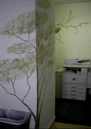
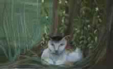
Tree with Cat Friends
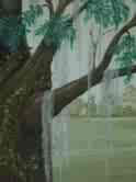
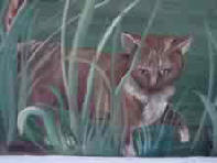
Detail of Tree