Colors & Vocabulary
Jackie Stacharowski
©2008 -
www.artistjackie.com
Learning about colors will help you with your painting.
Your choice of colors, their intensity and their temperature
will have a major impact on how well your painting will turn out.
Color Vocabulary
All fields have their own jargon and art is not an exception. If you learn a few basic terms it will help you when you read, talk, or discuss colors.. These expressions are used in our class, as well as throughout the world of art.
Hue -
Primary Colors -
Secondary Colors -
Color Wheel -
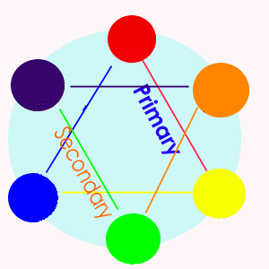
Complementary Colors -
Why and When to use complementary colors? If you want a color to be less intense then it is, you can mix into it a small amount of its complement into it. This will tone down the intensity.
If you are painting a flower, or anything for that matter, and part of it is in direct sunlight -
If you are painting a landscape that has several blue buildings in it, the closest one should have the most intense blue. The ones going back into the distance should each be less intense as they get further away.
Local Color -
Color Field -
Pigments -
Some pigments are natural, just grounded up dirt, stone, and clay… Some pigments are elements found in nature, such as cadmiums or oxides. Some pigments are man-
Temperature -
Warm colors -
Cool colors -
Although at first it seems simple, red and yellow are warm and blue and green are cool …however:
Any color can be either warm or cool.
There are orangey reds that are warm and purplish reds that are cool. There are purplish blues that are cool and greenish blues that are warm. There are lemony yellows which are cool and orangey yellows which are warm. There are bluish purples that are cool and reddish purples which are warm. There are reddish browns which are warm and greenish browns that are cool. There are bluish grays that are cool and pinkish grays which are warm. There are bluish whites which are cool and yellowish whites which are warm. There are yellowish greens which are warm and bluish greens which are cool….
Why is it important to understand what the temperature is of the color you are using?
One reason has to do with perspective. Our eyes see warm colors as being closer to us and cool colors as being further away. So to fool the viewer's eyes and to give depth to your painting, use the right temperature and you'll succeed.
Another is in color mixing. You will achieve better results if you mix two warm colors together to get a third, or two cool ones, otherwise the resulting color could come out muddy.
Value -
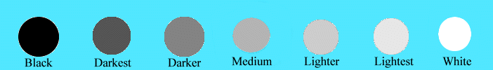
Black & White & Five Different Values In-
Think of looking at a black and white photo, the contrasts among the different shades of gray help to give form to the objects in the photo. An easy way to judge if you have enough contrast in your paintings is to look at your canvas through a red filter. Although there are red photographic filters you can buy, you can use a transparent piece of plastic, or several layers of red plastic wrap. Red is strong enough to hide the other hues in the painting to give you a 'black & white' or 'monochromatic' version to review.

Use different values give the illusion of 3-
Rectangles -
Round or Curved Stuff -
Distance -
Lighting a Scene -
Contrast is the difference between two things -
How to get a value: A very general rule is to use the color from the tube as your medium value. Then add different amounts of white to get lighter values and different amounts of black to get darker values. There is a temptation to use white and black straight from the tube for the lightest and darkest values, but except for very graphic renderings: DON'T DO IT!!! Use white and black just to add to other hues.
Exceptions -
If you add white to red, you get pink and not light red… so use the red from the tube as your lightest value and add different amounts of black (or brown) to make the darker values. You can add a little yellow to red -
If you add black to yellow, you get green and not darker yellow… so use the yellow from the tube as your darkest value and add various amounts of white to get your lighter values. You can add a little brown to yellow to make it darker, but this had to be done with care.
You don't need to mix your batches totally, by leaving the paint variegated, it will mix on the canvas -
You cannot really judge a color while it is still on your palette! What matters is how the color appears when it is on the canvas, related to the other colors there.
Don't get discouraged if you don't get the color you want on the first try, most of us don't -
As you are mixing, if your paint puddle becomes large, it is OK to separate out just some of the paint and keep mixing from there, the unwanted color can be saved to be used at a later time -
Formulas
You can use these formulas to get colors to use. These are suggestions only! It is best to play with the paints you have and mix them together in different ways to get the color that you really want. It is best to add a little at a time -
Black -
Skies
Most summer skies are Ultramarine Blue, other seasons usually Cerulean Blue. To make a grayer sky add a very small amount of burnt sienna -
If you want to add yellow into your sky, first paint the area white -
Sunrise and Sunsets -
Water
Most water reflects the color of the sky. For Oceans -
Trees and Grass
The best colors to use for leaves are Sap Green, Yellow Ochre, Raw Sienna and Burnt Sienna. By mixing these in different amounts you will get many shades of natural looking greens. Then add white and black to change the values of these greens. The best color to use as shadow areas within leaves and grass is purple. Mix Alizarin Crimson with your sky color and use this as the lightest value of your shadows.
Tree Trunks
Most trunks are more gray than brown. The umbers are your best choice. Use Raw Umber if you need a cool greenish brown. Use Burnt Umber if you need a warm reddish brown. If it is still too brown, add some gray or purple, a little at a time.
Rocks and Stones
The colors of stones vary greatly -
Sand
There are many colors of and within sand. It is not just beige. Sometimes the sand is pinkish and sometimes it is grayer and sometimes it is bluer… A good basic mix for sand is Raw Sienna and White. Then add a touch of red or blue or purple or gray to it -
Dirt
Varies according to what kind of dirt you are trying to paint. Sandy soils -
Snow
Use white as your highlight on snow, not as the snow itself. Yellow Ochre as well as the reflected color of the objects within the scene. In shadows, and for sunrise and sunset, snow reflects the colors of the sky and its surroundings, usually pale purples, pinks and grays.
White Objects
Objects with a local color of white are tricky to paint correctly. It is best not to use white out of the tube as your local color -
Skin
Varies by person. However, Raw and Burnt Sienna mixed with White, Yellow Ochre and/or Ultramarine blue will give you a basic skin tone. Usually a mixture of a combination of these will work. Use purples, not grays, for your skin shadows to give a more natural look.
Lips
Unless you are painting someone with lipstick, use Burnt Sienna as your basic lip color; for non-
Remember -
With practice and experience you will soon have a better feel for mixing colors!
All work is copyrighted and subject to Federal Copyright Laws.
All rights are retained by Jackie Stacharowski unless otherwise negotiated.
The viewer of this information understands and agrees that these concepts
are the property of Jackie Stacharowski and may not be copied without the written agreement of the artist.